Website home band for nephews HERE
Posted by Sid Charity
Thursday, 1 April 2010

Wednesday, 10 March 2010
Monday, 8 March 2010
Sunday, 7 March 2010
Friday, 5 March 2010
 TEXTAREA_ID
Friday, 11 December 2009
+.jpg)

Wednesday, 9 December 2009
amended cd cover
This is the amended cd cover that I (Tom Elwes) created for are promo pack.

The CD cover that I have created is different from a lot of the CD covers that are on artists CD’s today because unlike the standard form for CD covers we have not put any members from are band on it. We also have not put any graphics that symbolise the band instead we have chosen to put the main actor from are music video on the front. The only other example of an artist doing this is the
We chose the image of a camera as are starting point. We felt that a camera lens had to be used because it was such a prominent image in the music video. It also helps promote the big brother (being watched) feel of the music video. Once I had the image of the camera I decided to distort the outer ring of the lens. I did this because it helps show the audience buying the CD although the bad are well dressed on the surface if you look deeper their lyrics can be quite dark and distorted.
The centre of the lens has a faded image of a main actor from are video (Max) I inserted him into the lens of the camera because it gives a juxtaposition between the actor who in the video is taking the images and the camera which he is always behind. Are actors facial expression is quite misleading just like the actor is in are video. At first look he seems to have a quite an aggressive look on his face. However if you look a little closer he is actually looking down at something, we tried to make him look like he was looking at the text in the bottom right hand corner of the CD cover.
The text on the cover is varied on the word kettle is supposed to be in spray paint and the word on is meant to be in standard text. This is relevant because it is meant to represent the two sides to the story or is music video. The scary stalker with the spray paint, and the twist at the end with the standard text.
Posted by Tom Elwes
Friday, 4 December 2009

Wednesday, 25 November 2009
Rough website home page
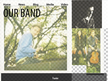
This is only a rough sketch, the spaces and photoshop background should be ignored. It's the general idea thats important. I incorporated the photos from our blog and arranged them to create a possible website format in photoshop. The format follows the narrative. The band and love interest are similarly represented in a casual manner in a natural setting whilst the stalker character is photographed in a professional style with moody lighting in black and white. His expression is serious. This represents the fact the stalker character is percieved as an outsider. However, it doesn't reflect the fact the stalkers in a relationship to the love interest in the narrative. This keeps the mystery alive for the viewing of the video.
This is merely the background and we plan to develop the idea. It may be necessary to take more photos specifically for this.
Posted By Sid Charity
Monday, 23 November 2009
CD cover idea drawn

This drawing reflects our idea for our CD cover. We plan to do it on photoshop and overlay an image that we have doctored to make transparent. This is a starting point and we need to develop it and brainstorm alternatives.
Posted by Sid Charity

Scouting for girl’s style of music is quite similar to are artist. They would come under the same genre of soft indie rock. Scouting for girls break through single was “heart beats”. The cover for the single uses a lot of pictorial space. The pictorial space is used because only half the cover has an image or any colour on. This gap creates a heavy contrast between the two sides of the cover. The female nurse on the cover appears to be slightly faded into the back ground this adds to the contrast between the two sides because the character acts like a mid point. The character looking over her shoulder at what appears to be an empty space helps represent the distance between the male character and the female character in the song. The song heart beats is about a boy losing a girls so presumably the cover is meant to represent the girl looking back and leaving the bleak emptiness of there relationship.
Monday, 16 November 2009
The Hoosiers CD Pack Analysis
Check out this SlideShare Presentation:
Posted By Edward Lindey
The Hoosiers CD Pack Analysis
View more presentations from sidcharity.
Posted By Edward Lindey
CD cover idea

One of our ideas for our single cover includes a photo similar to the one to the left. We will photoshop a photo of the band and make the illusion that they're sitting in the lens. It would also be a good to include a CU of the love interest behind them seeing as she's the one who was taken pictures of. We would adapt the writing around the lens to say the title of the song and the name of the band.
Posted by Sid Charity
Sunday, 15 November 2009
Film Update

These polaroids are from the set for the darkroom scene. We used the corner of a black drama studio. We gathered appropriate props such as:

- a well used table,
- lamp with red gel to imitate a safety light,
- processing trays,
- a bin,
- a line and pegs as well as photos we developed to hang up,
- some negatives and a mirror to give us some artistic leverage. I'm very satisfied with our set and i've reclaimed a sink from a salvage yard to add to the realism of our mise-en-scene. We told max (the man in the photo) to wear a white t-shirt so that the projection of our love interest would show up on him. We also used the lights available in the studio and dimmed them to create a moody atmosphere. Even though this removed continuity, it doesn't seem out of place and it's very likely he would wear something different for the dark room. It's also worth the aesthetic enhancement as well as a strengthening of narrative.
Posted by Sid Charity
Friday, 6 November 2009
Single Cover Analysis

This single cover for The Beatles is an excellent example of a certain image trying to be sold to the public. The band itself is trying to sell a hippie image of themselves. The wavy writing is very peaceful and creates a chilled vibe and gives a good description of what the two songs are about. The songs themseleves are very laid back and relaxed with a very hippie vibe. Revoloution especially is about not wanting violence. I think that the image of the band on the front shows the band wearing relaxed, baggy, hippie clothes that convey thier love for peace instead of violence.
This cover is very good at selling the artist as it conveys the message and ideology of the band off the cuff. This is something that would probably be a good idea for us. To be able to convey our artist and the type of music that the single is on the album cover is the best way to make sales. For our album cover we would have to include images our band plus possible stills from our video to be able to further sell our artist. It would also be best if we could include something to try and show what our song is about.
Posted by Edward Lindey
Hoosiers CD cover analysis
 This CD cover promotes the artist. The CU of the main artist highlights his preense as the leader of the group. His face is half cast in shadow which represents him as mysterious and powerful. His expression is one of intrigue, and makes us wonder what he's looking at and could imply that we as the audiance is Mr. A, because he's looking at camera. Mr. A is the subject of the song and in the narrative they capture him. This could represent the beggining of the narrative when they first come into contact with him. The other band members are compositionally positioned behind each other to create a sense of depth. The costume of the band is indie in style. However, they're all dressed individually within the style and are all looking in different directions and posing differently. This all equates to a band represented as individuals. They all look like they're in action and the photo captures a narrative. The dark and silhouetted background also adds a sense of mystery. The owls also serve this function and are symbols of wisdom, which could reflect on the band. They're in flight which suggests they're flying away from something. The text is in contrast with the background and is in spooky writing.
Posted by Sid Charity
Tuesday, 3 November 2009
Actor Issues
On our first day of filming it became apparent that our lead singer was very uncomfortable with the position we had given him, especially with the lip syncing. Unfortunately we did not have another person who was willing to take over the role so in the end we came to the conclusion that one of us would have to do it and Sid decided that he would do it. The next day we came across another issue when our drummer decided to pull out on short notice. This left us in a similar dillema and therefore I (Edward) had to voulenteer to be the drummer. I took a few Polaroids whilst on the set and there are also some images of Sid and I on set but not in costume. Images of us in costume are soon to come. 

Posted By Edward Lindey


Posted By Edward Lindey
Monday, 2 November 2009
post-shooting analysis
We have learnt a great deal from shooting over half term. We should've been more empathetic to our talent. We should've treated them with more respect during filming and done everything we could to make them feel comfortable. Even though we bought them food and drinks for the time they were working it was their emotional aspect we didn't properly cater for. This was evident because our first singer was especially awkward in front of camera as well as our first drummer. They both dropped out.
We have also learnt about organisation.
We have also learnt about organisation.
- We need to reherse our shots and refine them before shooting.
- Make sure we have transport (we couldn't use the car we planned to use) which meant our locations were limited.
- Plan when and where we needed specific talent. Some of our actors were present for time they didn't need to be. This made them distressed becasue they have work to do during half term as well. This compromised their willingness to contribute their upmost when it came to their turn.
- We had limited sunlight hours, starting earlier would've solved this.
- plan which shots to do when.
- We couldn't gain access to the dark room at school to film our processing scene and couldn't access school during half term so have to film that scene in the near future.
We made a lot of decisions about what shots to shoot when we were filming and loosely stuck to our storyboards. The concept remained the same except we adapted the twist at the end. We originally planned a CU of the "stalker," in bed, which zoomed out to reveal the love interest in the bed as well. Implying their married. We chose to do the same, except with the rest of the band in the same bed as well. This added a comic factor, as well as playing on the fact the band are portraying the narrative.
Posted By Sid Charity
Subscribe to:
Posts (Atom)