
Friday, 11 December 2009

Wednesday, 9 December 2009
amended cd cover
This is the amended cd cover that I (Tom Elwes) created for are promo pack.

The CD cover that I have created is different from a lot of the CD covers that are on artists CD’s today because unlike the standard form for CD covers we have not put any members from are band on it. We also have not put any graphics that symbolise the band instead we have chosen to put the main actor from are music video on the front. The only other example of an artist doing this is the
We chose the image of a camera as are starting point. We felt that a camera lens had to be used because it was such a prominent image in the music video. It also helps promote the big brother (being watched) feel of the music video. Once I had the image of the camera I decided to distort the outer ring of the lens. I did this because it helps show the audience buying the CD although the bad are well dressed on the surface if you look deeper their lyrics can be quite dark and distorted.
The centre of the lens has a faded image of a main actor from are video (Max) I inserted him into the lens of the camera because it gives a juxtaposition between the actor who in the video is taking the images and the camera which he is always behind. Are actors facial expression is quite misleading just like the actor is in are video. At first look he seems to have a quite an aggressive look on his face. However if you look a little closer he is actually looking down at something, we tried to make him look like he was looking at the text in the bottom right hand corner of the CD cover.
The text on the cover is varied on the word kettle is supposed to be in spray paint and the word on is meant to be in standard text. This is relevant because it is meant to represent the two sides to the story or is music video. The scary stalker with the spray paint, and the twist at the end with the standard text.
Posted by Tom Elwes
Friday, 4 December 2009

Wednesday, 25 November 2009
Rough website home page
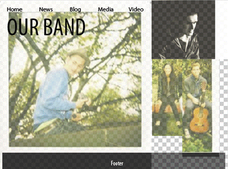
This is only a rough sketch, the spaces and photoshop background should be ignored. It's the general idea thats important. I incorporated the photos from our blog and arranged them to create a possible website format in photoshop. The format follows the narrative. The band and love interest are similarly represented in a casual manner in a natural setting whilst the stalker character is photographed in a professional style with moody lighting in black and white. His expression is serious. This represents the fact the stalker character is percieved as an outsider. However, it doesn't reflect the fact the stalkers in a relationship to the love interest in the narrative. This keeps the mystery alive for the viewing of the video.
This is merely the background and we plan to develop the idea. It may be necessary to take more photos specifically for this.
Posted By Sid Charity
Monday, 23 November 2009
CD cover idea drawn

This drawing reflects our idea for our CD cover. We plan to do it on photoshop and overlay an image that we have doctored to make transparent. This is a starting point and we need to develop it and brainstorm alternatives.
Posted by Sid Charity

Scouting for girl’s style of music is quite similar to are artist. They would come under the same genre of soft indie rock. Scouting for girls break through single was “heart beats”. The cover for the single uses a lot of pictorial space. The pictorial space is used because only half the cover has an image or any colour on. This gap creates a heavy contrast between the two sides of the cover. The female nurse on the cover appears to be slightly faded into the back ground this adds to the contrast between the two sides because the character acts like a mid point. The character looking over her shoulder at what appears to be an empty space helps represent the distance between the male character and the female character in the song. The song heart beats is about a boy losing a girls so presumably the cover is meant to represent the girl looking back and leaving the bleak emptiness of there relationship.
Monday, 16 November 2009
The Hoosiers CD Pack Analysis
Check out this SlideShare Presentation:
Posted By Edward Lindey
The Hoosiers CD Pack Analysis
View more presentations from sidcharity.
Posted By Edward Lindey
Subscribe to:
Posts (Atom)